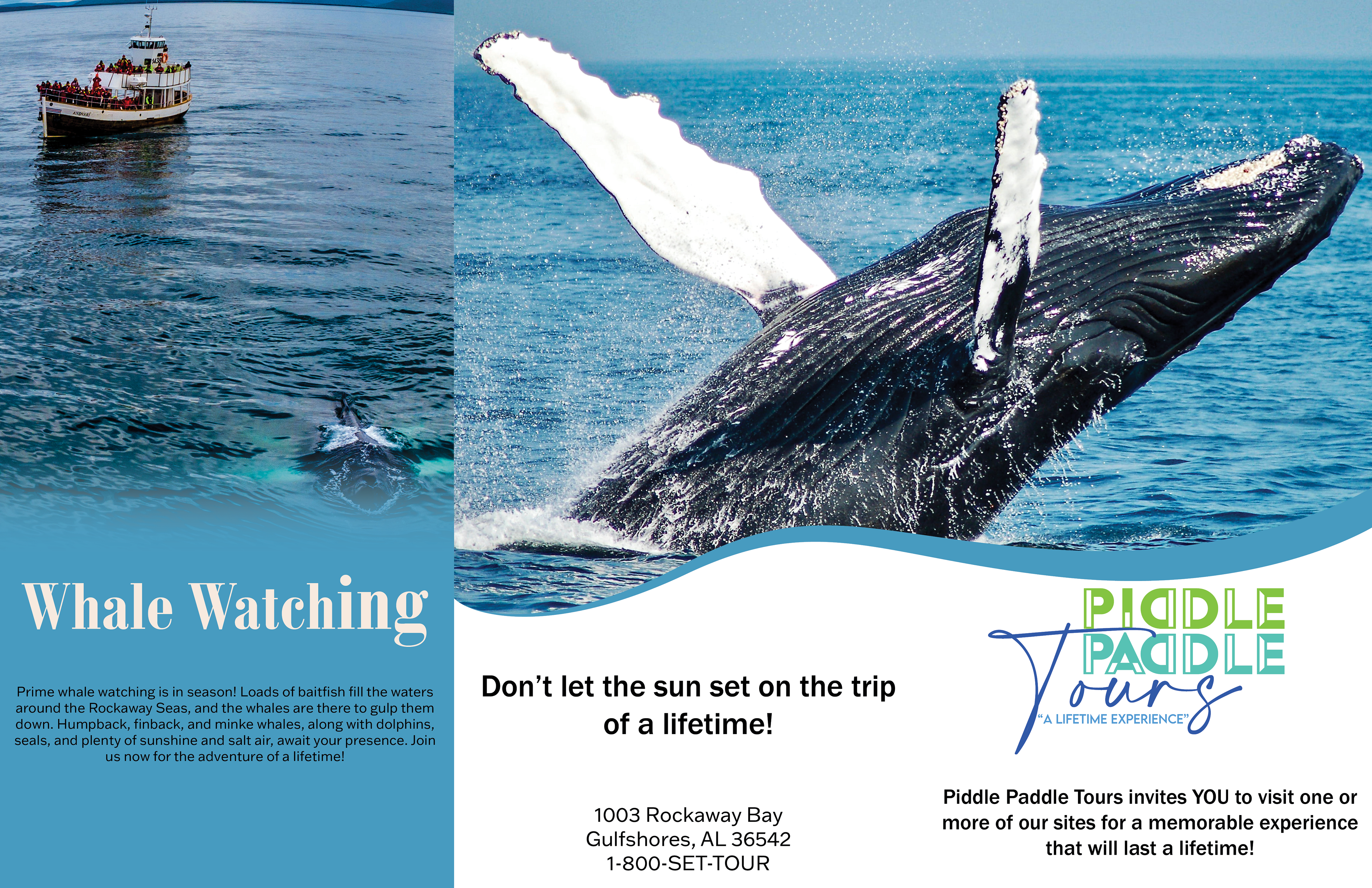
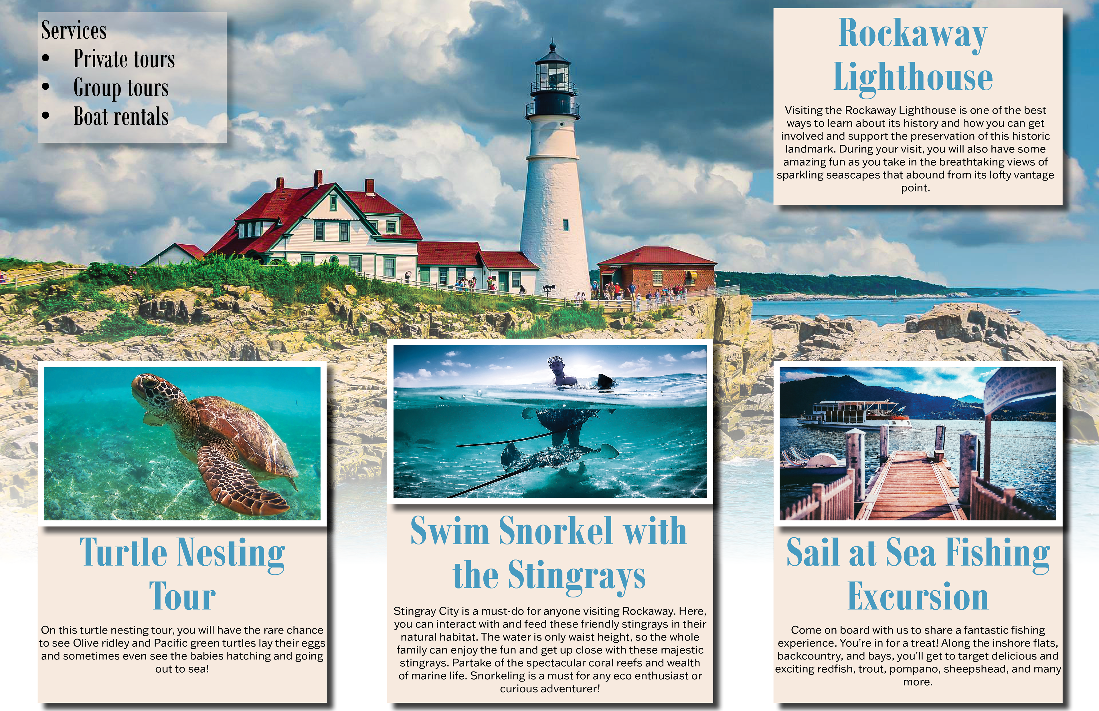
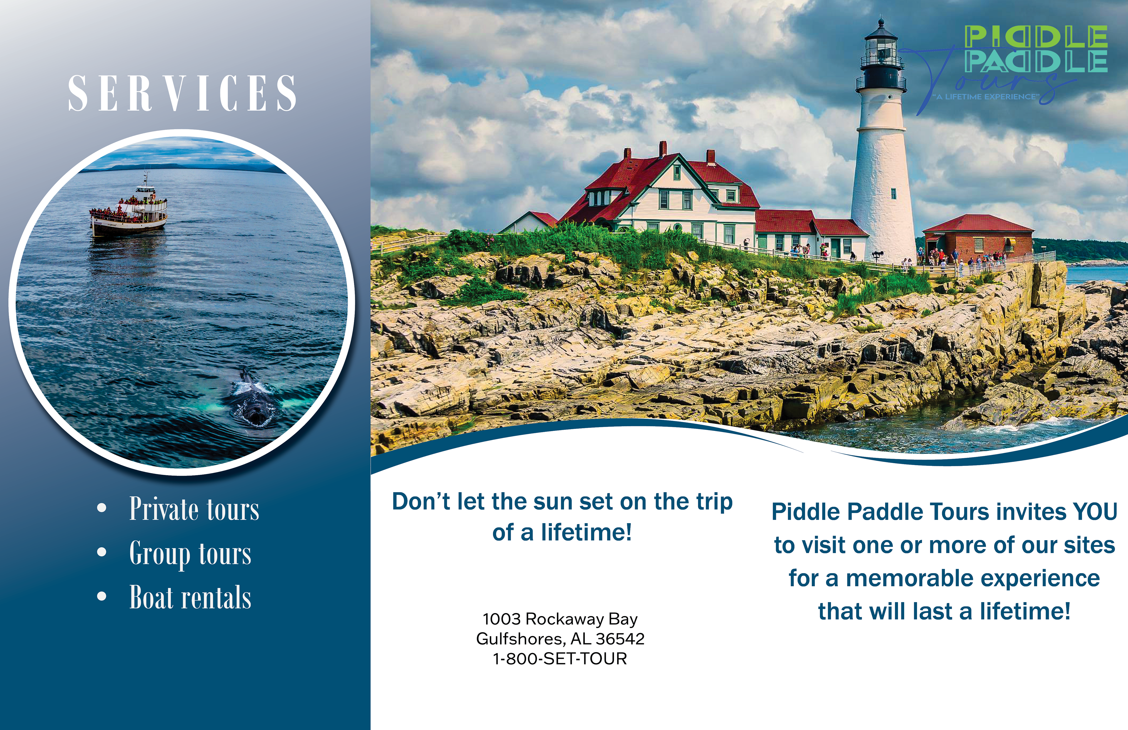
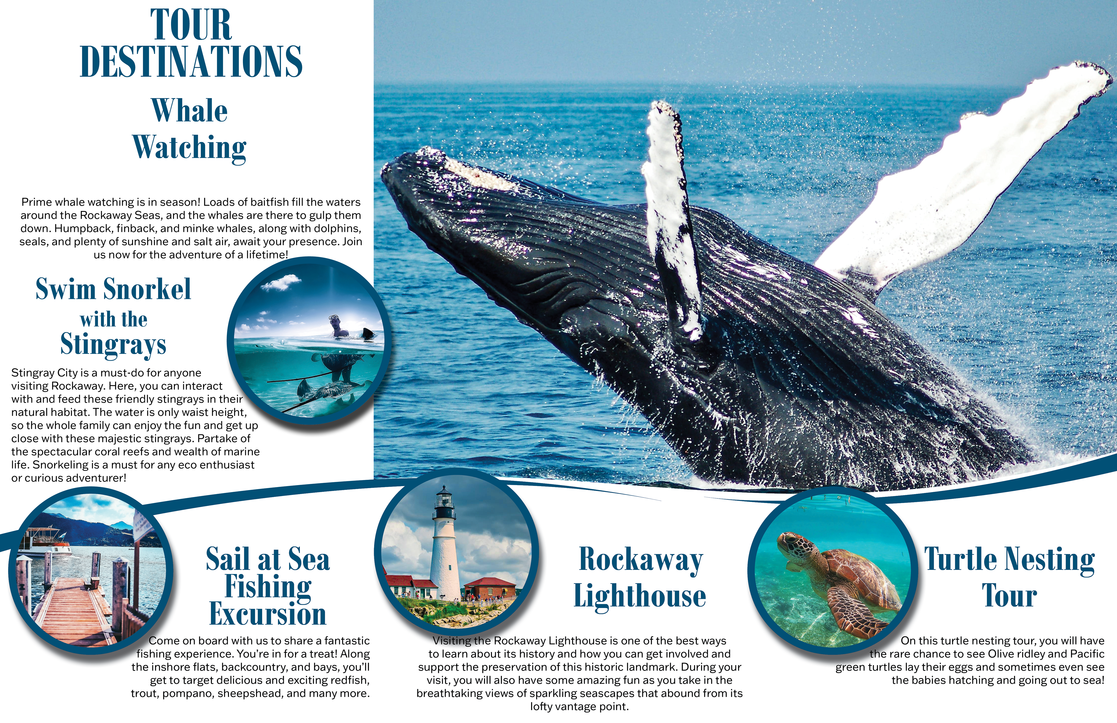
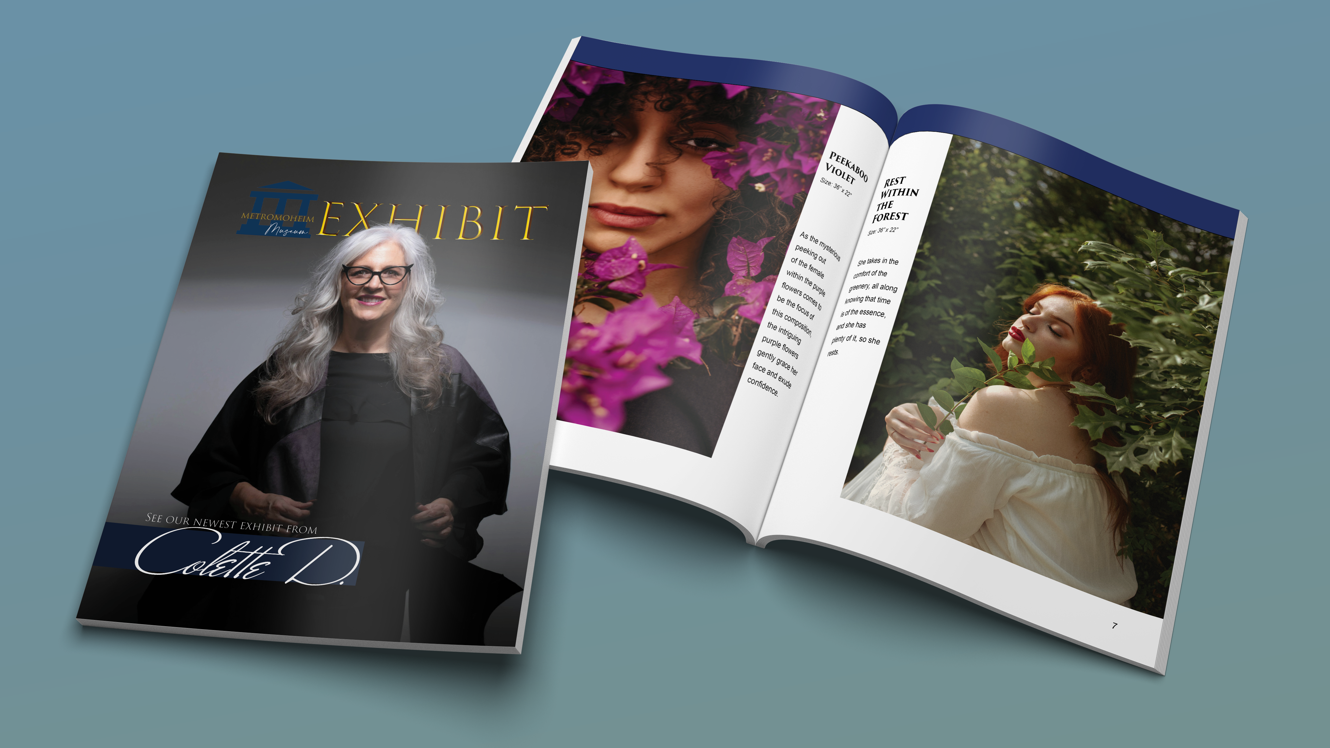
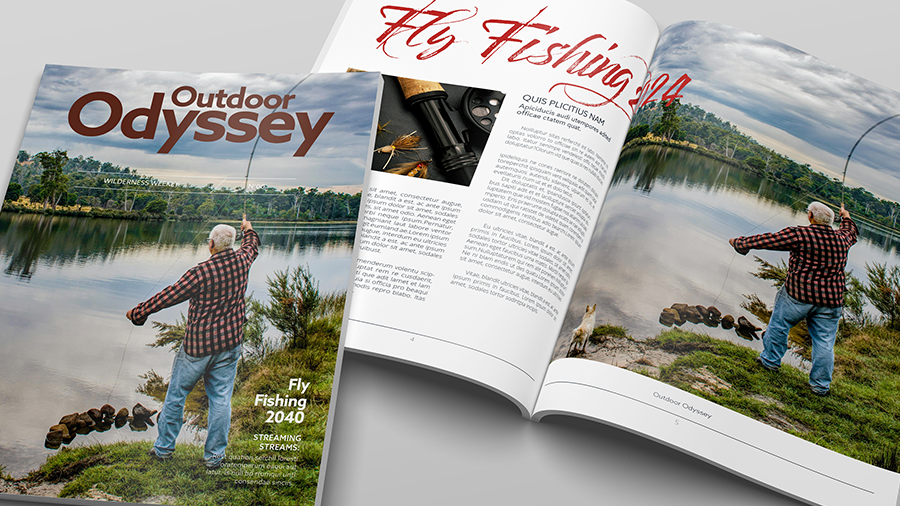
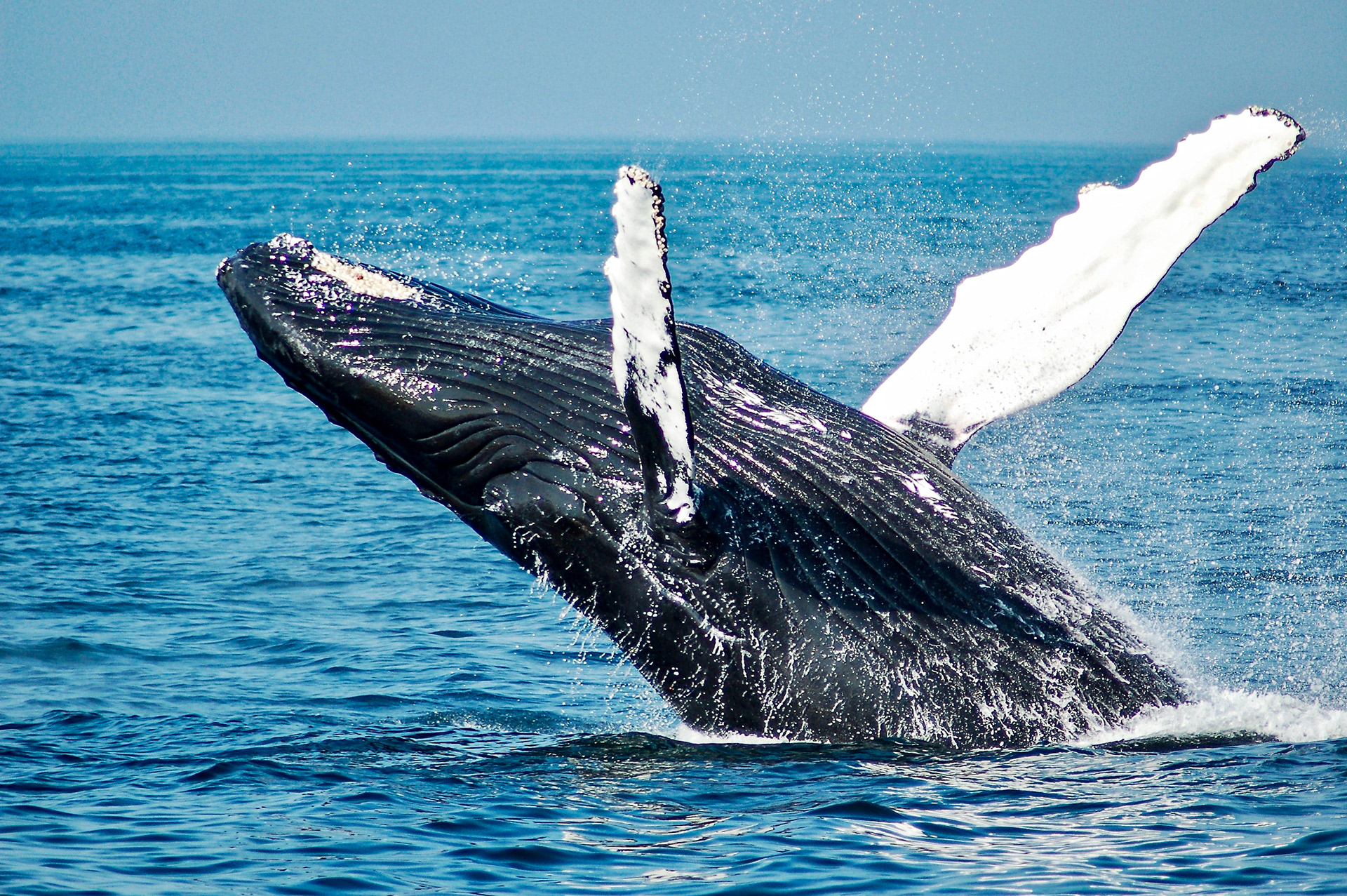
As a class project, I had to create two brochures for a company that specialized in family-friendly boat tours. These tours include whale watching and sightseeing of historical town landmarks. The project required making a trifold brochure with provided information, a call to action, and photographs.
When creating this brochure, I wanted to create a layout that was attractive to the eye with vibrant images, minimal colors, and great use of white space.
Brochures made with Adobe InDesign
Before Pictures
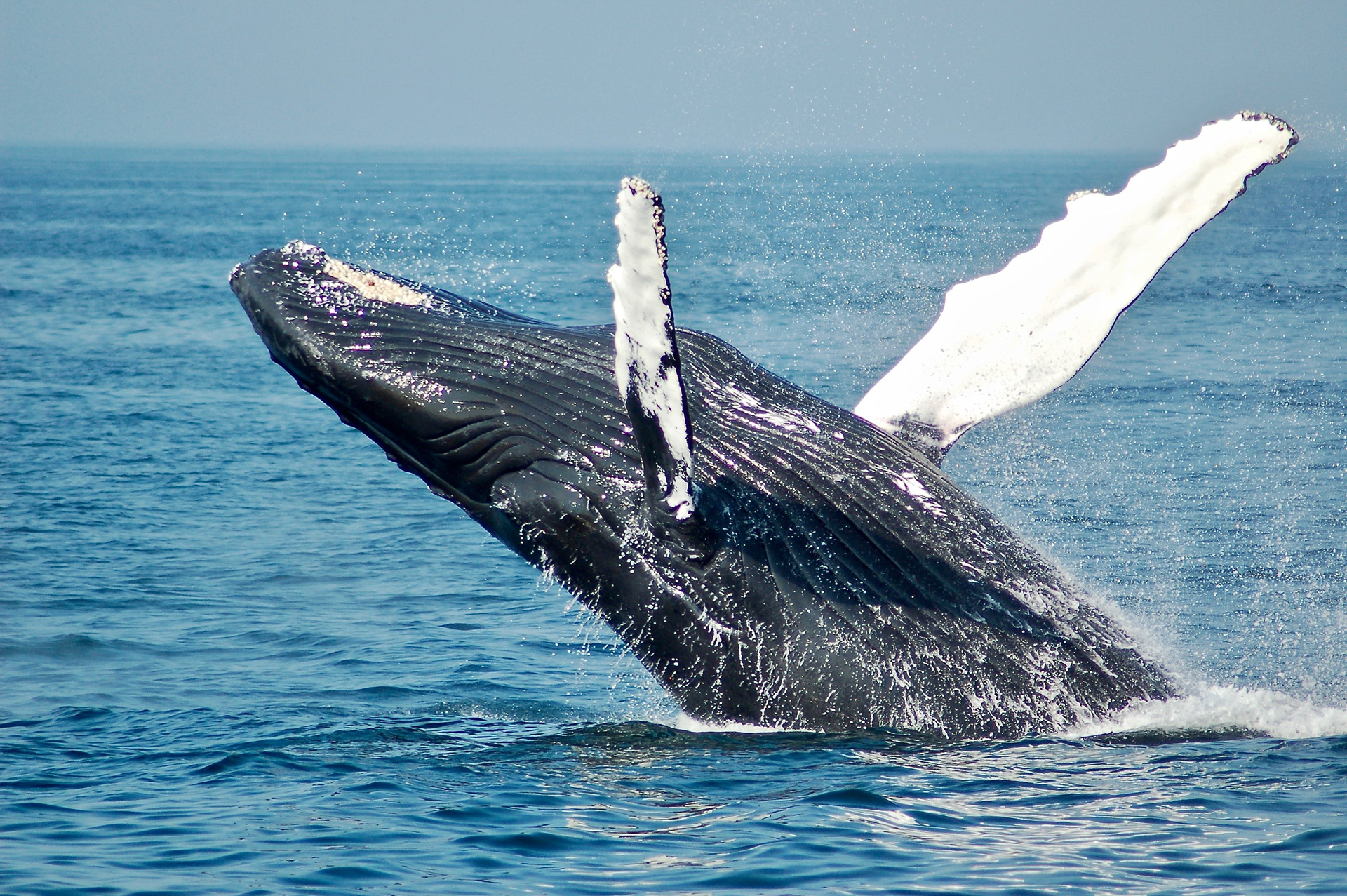
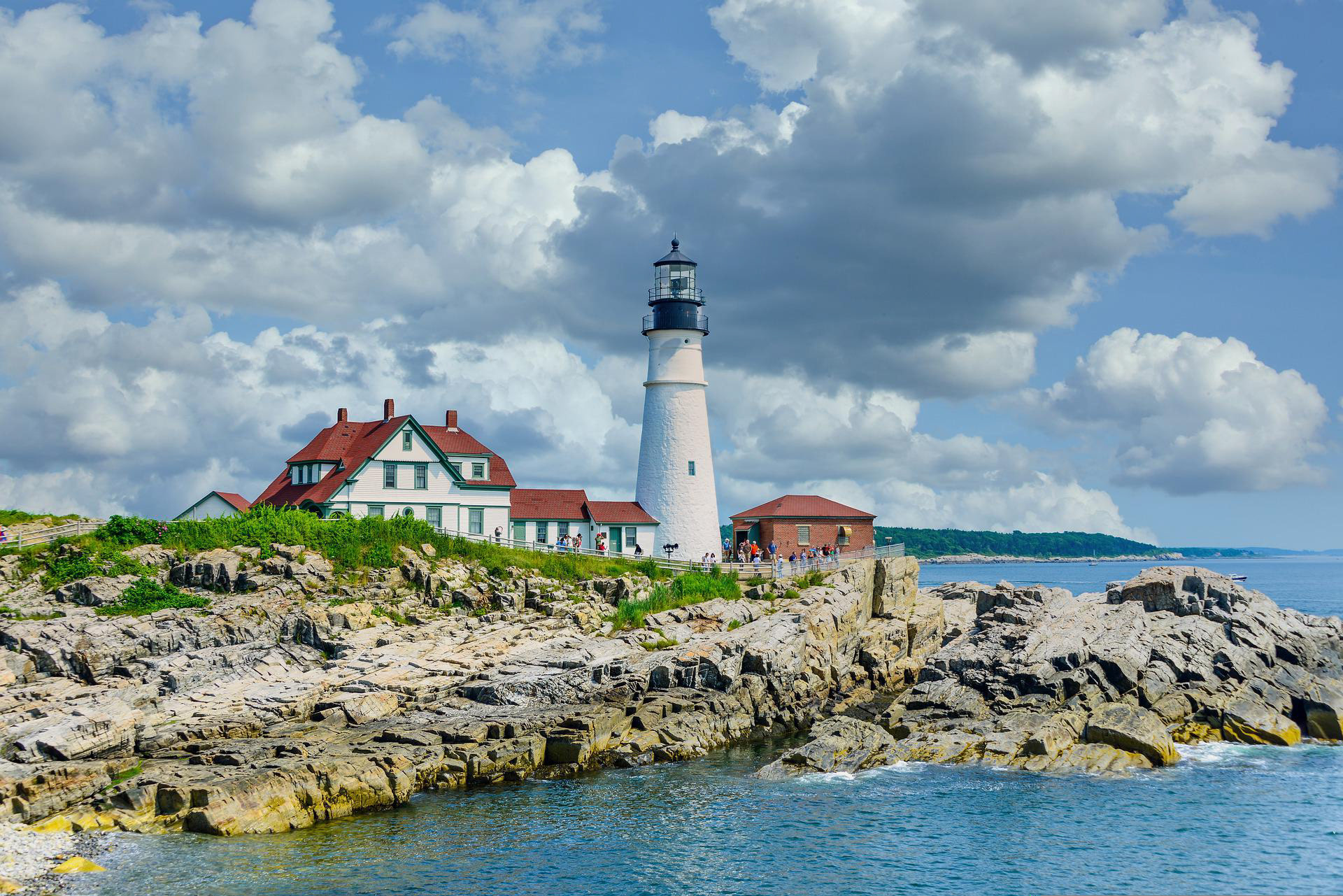
After Editing Pictures
Before designing these brochures, I changed the image size in Photoshop from 72 PPI to 300 PPI and enhanced the colors to bring out more of the natural colors.
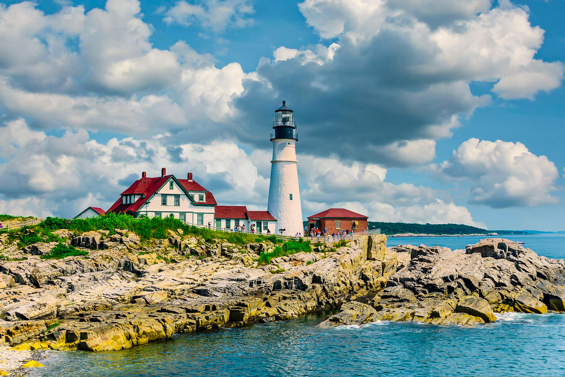
When I designed the brochures I combined modular and hierarchical grids in order to make use of white space, emphasis, and hierarchy. I also used sampled the colors from the lighthouse photo and used them throughout the brochures.
