As a class project, I was given a client briefing for a new brewery called The Golden Hop. The Golden Hop prides itself on using Golden Hops as a main ingredient for its beers. The brewery plans to open a main floor that will be for patrons to drink, eat, relax, and have great night out.
The visual requirements included two colors and two typefaces. In addition, the logo had to utilize a unique image that was serious, yet whimsical.
Logo made with Adobe Illustrator.
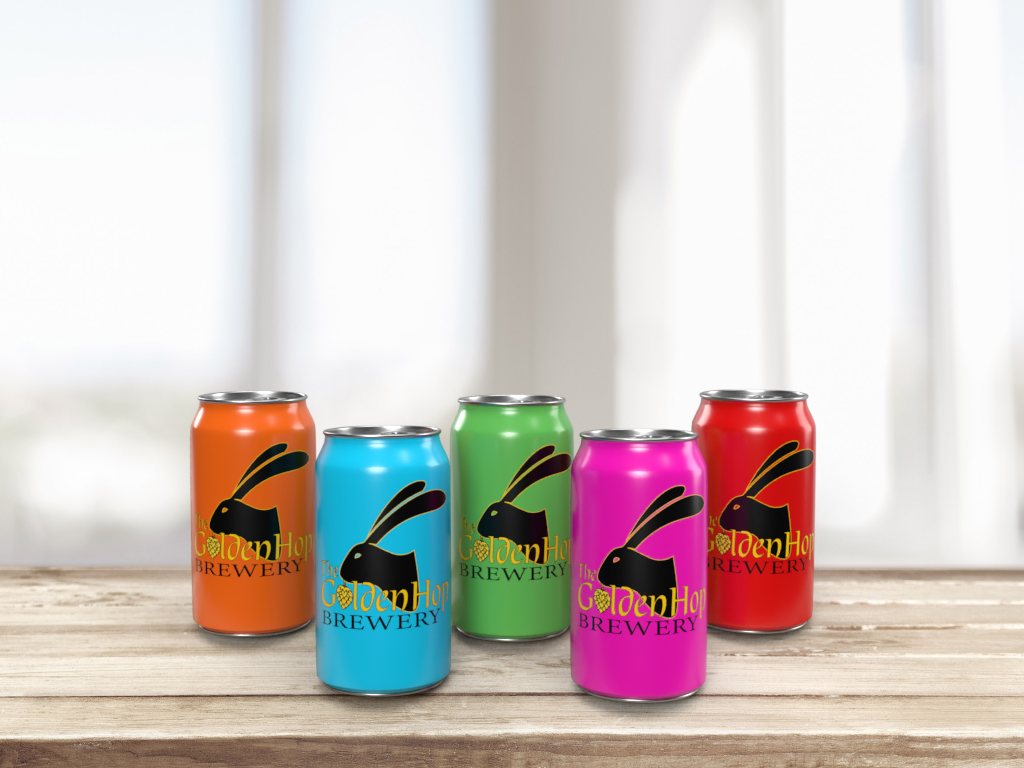
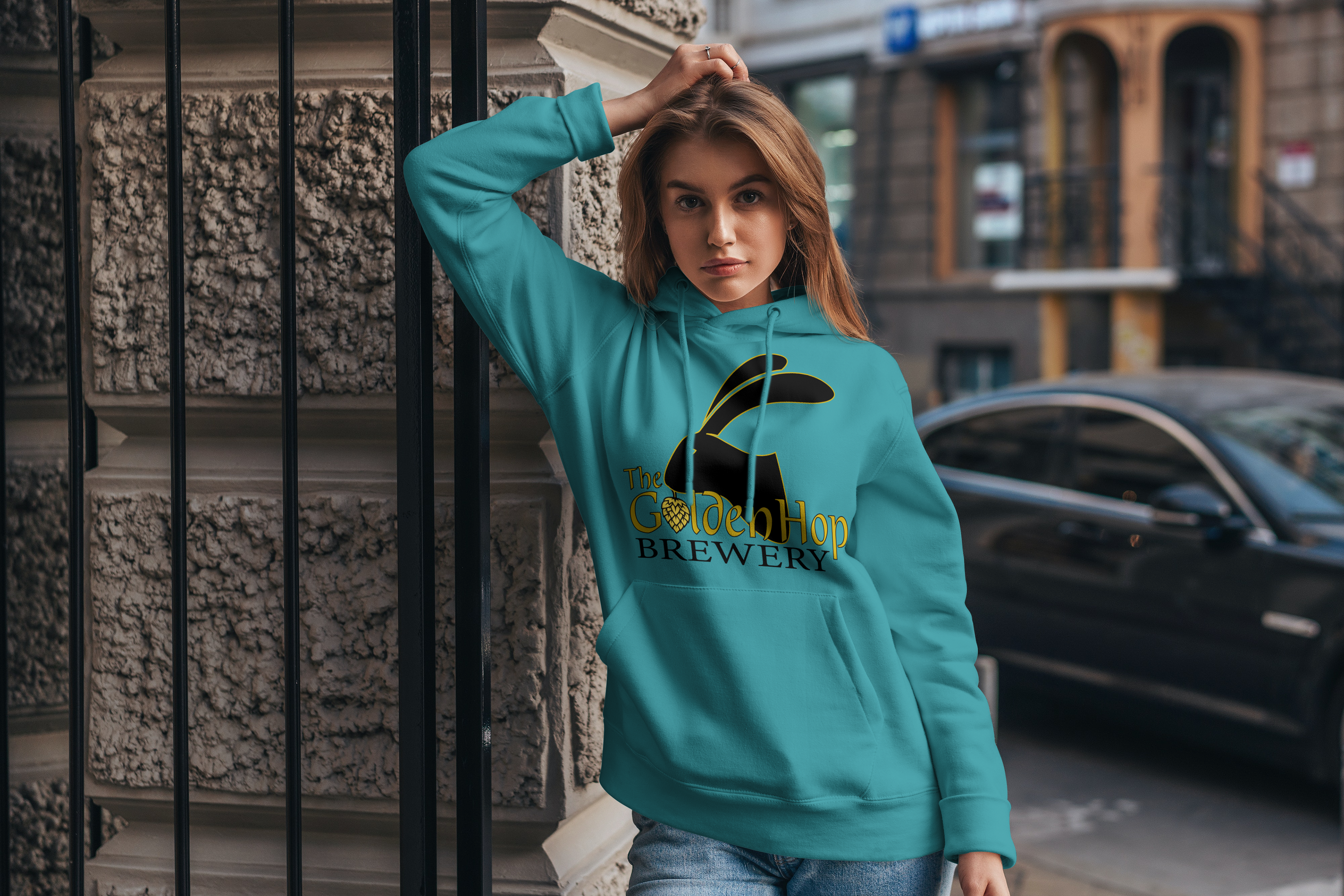
Mockups made with Adobe Dimensions and Photoshop
After coming up with three sketches that I was satisfied with, the final logo that was chosen was a rabbit head with a hop hanging from it's mouth and the name of the company, The Golden Hop Brewery.
The rabbit embodies agility, speed, and abundance, aligning with the brewery's values of efficiency and offering a variety of beers. In addition, the hop is a visual representation of the core ingredient. The brandmark is a clever fusion on the word hop that reinforces the brewery's identity and makes the logo memorable and recognizable.
Type and Colors
The primary typeface used for the Golden Hop logo is the Dublin typeface. It is a handwritten serif that is sophisticated with elegant curves and distinctive letterforms. Dublin is classic, yet modern. It is a work of craftsmanship and authenticity, making it perfect logo for a brewery making craft beer.
The Golden Hop's secondary typeface is Minion which provide contrast and versatility to Dublin, while adding a beautiful sense of hierarchy.
The Golden Hop's primary colors are gold and black. They evoke a quality of craftsmanship, commitment, refinement, and excellence.
Mockups
